Wednesday, February 29, 2012

Principles of Design Project

   Our project is about representing the principles of design with photographs
that have a theme. We choose vintage fashion as a theme through wardrobe that 
the models would wear.

Balance: the dress with flower relates to nature in the background.
Light source: scrim

Contrast: the black and white color makes contrast in the photograph.
Light source: tungsten

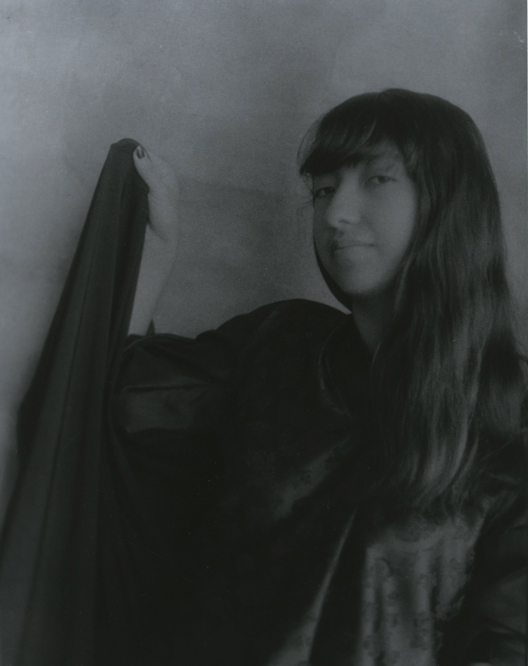
Emphasis: as the model is doing motion she is more emphasized than the plain background.
Light source: sun in front of the model.

Pattern: the repetition of a pattern is shown in the dress.
Light source: tungsten

Unity: the models create oneness with the same style ofwardrobe 
and how they are holding their hands.
Light source: north light

Thursday, January 19, 2012

Scrim assigment

 What do you see?
I see a girl lying in grass. She is wearing a plaid shirt with a mustache necklace.
Her hand is reaching out to a flower.
How is the work organized?
The plaid shirt gives a well contrast with the lines. For the background there is light
so the background wouldn't  extend into dark grass and we get different tones.
What is the artist trying to communicate?
I am not sure I just thought it look pretty, but it haves a soft happy feeling.
What do you think of the work?
I think it wast succesful. I liked the different tones and contrast and it in focus.

Tuesday, January 17, 2012

North Light

What do you see?
A girl with dark curly hair, she is wearing a jacket with a dark shirt. She is holding a curly iron while looking at her hand.
How is the work organized?
I set the model to look in pain.The hair gives the photo texture. Her hair and shirt gives good contrast in tones.
What is the artist trying to communicate?
That she is in pain because she got a little burned with the curling iron.
What do you think of the work?
I think it was succesful. I got the emotion, the contrast and the focus right.

Tuesday, December 13, 2011

Every person has an innovator inside them :)

My weakness is that I get discouraged by comparing myself to better dancers with better technique. Then I start to think that I am not going to reach my goal as a professional dancer. That affects me in the way that I can't improve gradually because I do not practice enough and use my 100% to reach my goal. My solution is to ignore those bad thoughts and stay with the positive. For example recently I have improves my balance and I am starting to stretch every day a while so that I get more flexible.  Instead of thinking of those good dancers as a discouragement,  I will see them as determined people that have worked hard to get where their are and as inspiring people to me.

Friday, December 9, 2011

Tungsten


What do you see ?
My classmate putting her leg  on the stool while looking towards the right and the reflection of her shadow.
How is the work organized?
 I used the rule of thirds and the shadow helps so It does not appear kind of in the middle. Like always it was a little unfocused but not too much and I would have preferred more dark tones.
What is the artist trying to communicate?
I think it portrays women fierceness but also smart and intelligent women.
 What do you think of the work?
It was successful. For me I think it is the second good picture that I have taken.


Thursday, December 1, 2011

Light source from the door.


What do you see?
 A girl grabing aside her cape, she is facing diagonal and looking up. Her shirt has a kind of pattern.
It looks like she is thinking.
How is the work organized?
Her hair is set aside so it did not covered her face and it looks soft. Their is not enough black tones in it. I like how the she is facing diagonal from the camera so it creates space and not that much of a portrait.
What is the artist trying to communicate?
It was dress like a hero day, so I decided to include the cape. I would like the photo more dark and more in focus.
What do you think of the work?
I think it was successful and i like the pattern of the shirt, but it was not in focus. One of my problems is not focusing well my photos.

Tuesday, November 8, 2011

Photoshop


  What do you see?
 A girl with a big red bow is standing at the right of the portrait. She is looking at the left. The background is grey tones. The work is figurative.
How is the work organized?
The grey background has dark and light tones that blend into each other. I like how the red bow pops.
What is the artist trying to communicate?
The girl is looking something at the left with a  confusion expression on her face. The photo was taken indoors in front of the door so the natural light could  reflect at her face.
What do you think of the work?
It was not successful, because she has dead eyes and it does not have enough texture.